
Pepp internationale Möbelspedition GmbH
New brand identity
Industry: Logistics & removals
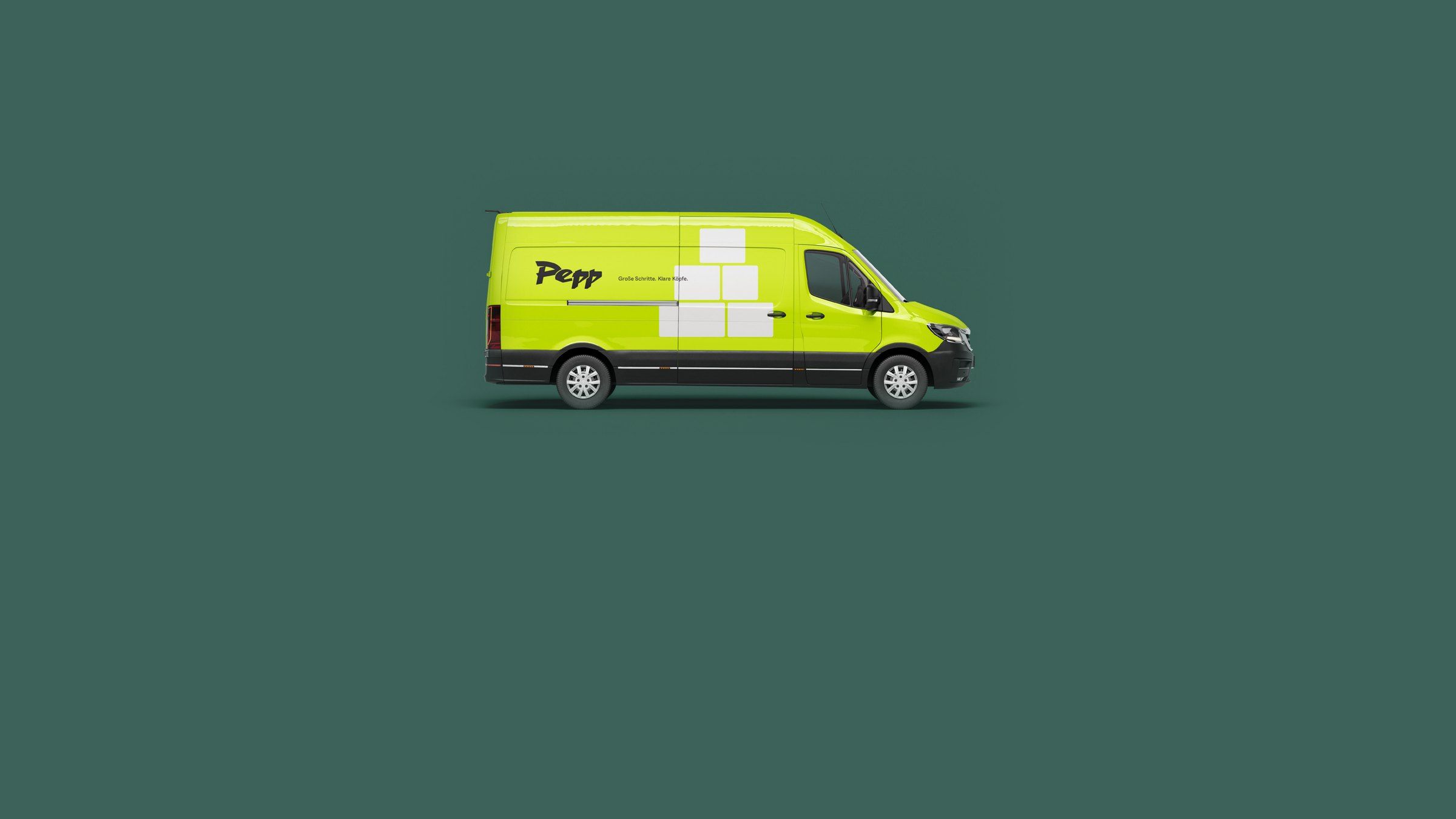
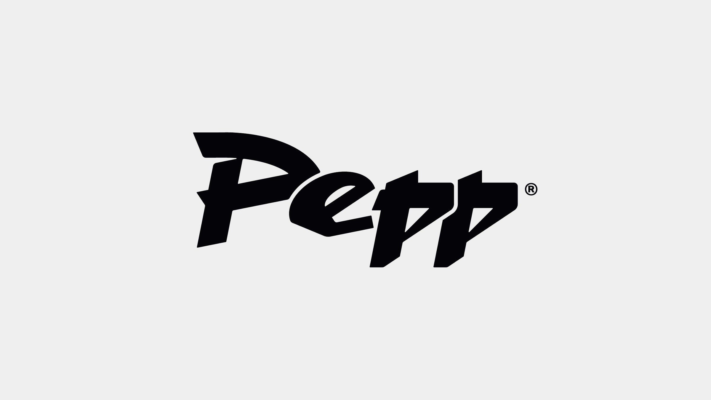
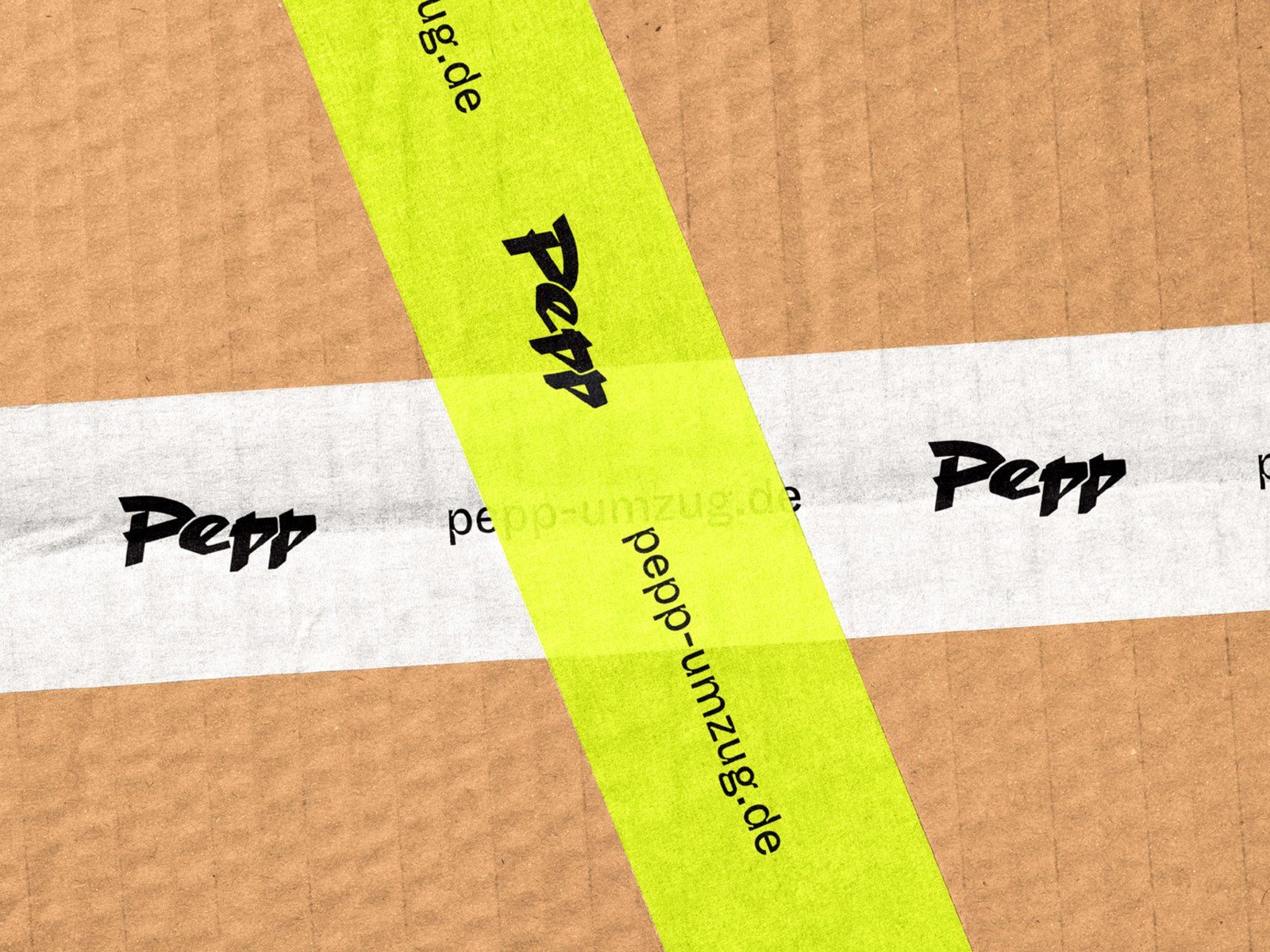
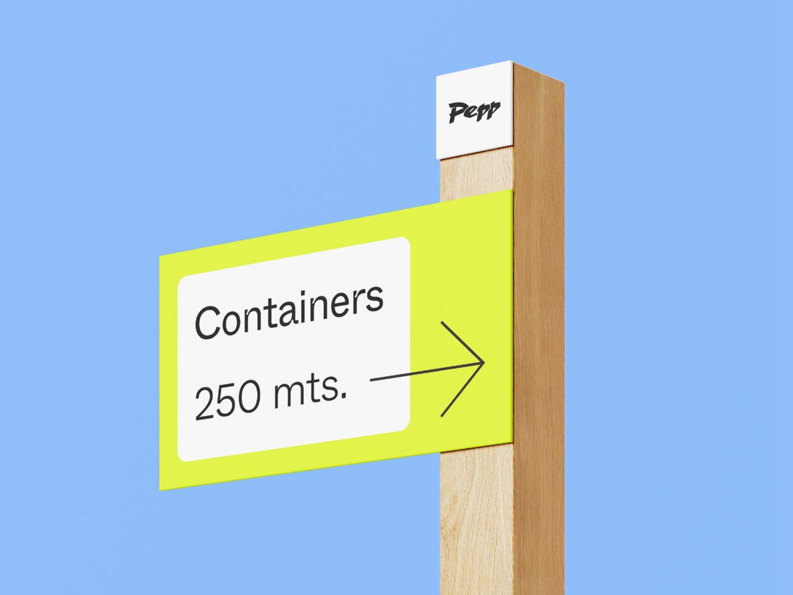
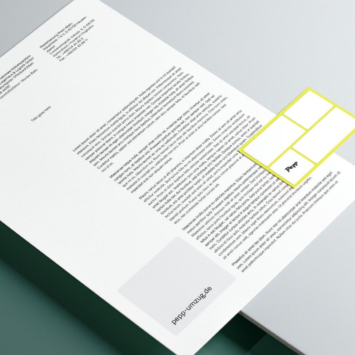
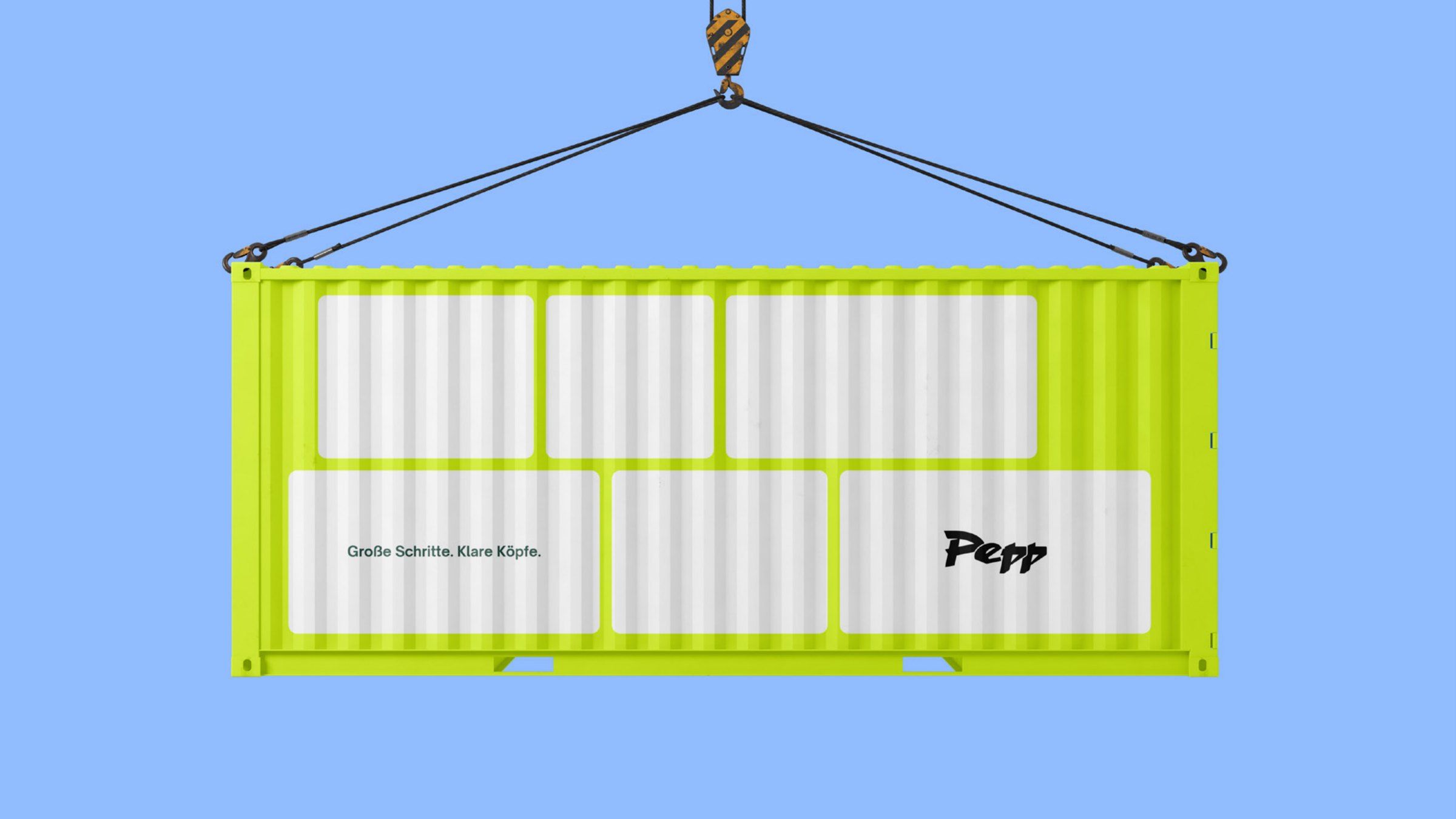
Pepp internationale Möbelspedition GmbH is an international removals company with sites in Heusenstamm and in Hattersheim at Frankfurt Airport. Besides home and office moves, Pepp stores furniture and containers, fits kitchens and supplies site, sanitary and storage containers. The old logo looked like a quick sketch. We redrew it and built the brand identity around it: colours, typefaces, imagery, a layout grid and key visuals.
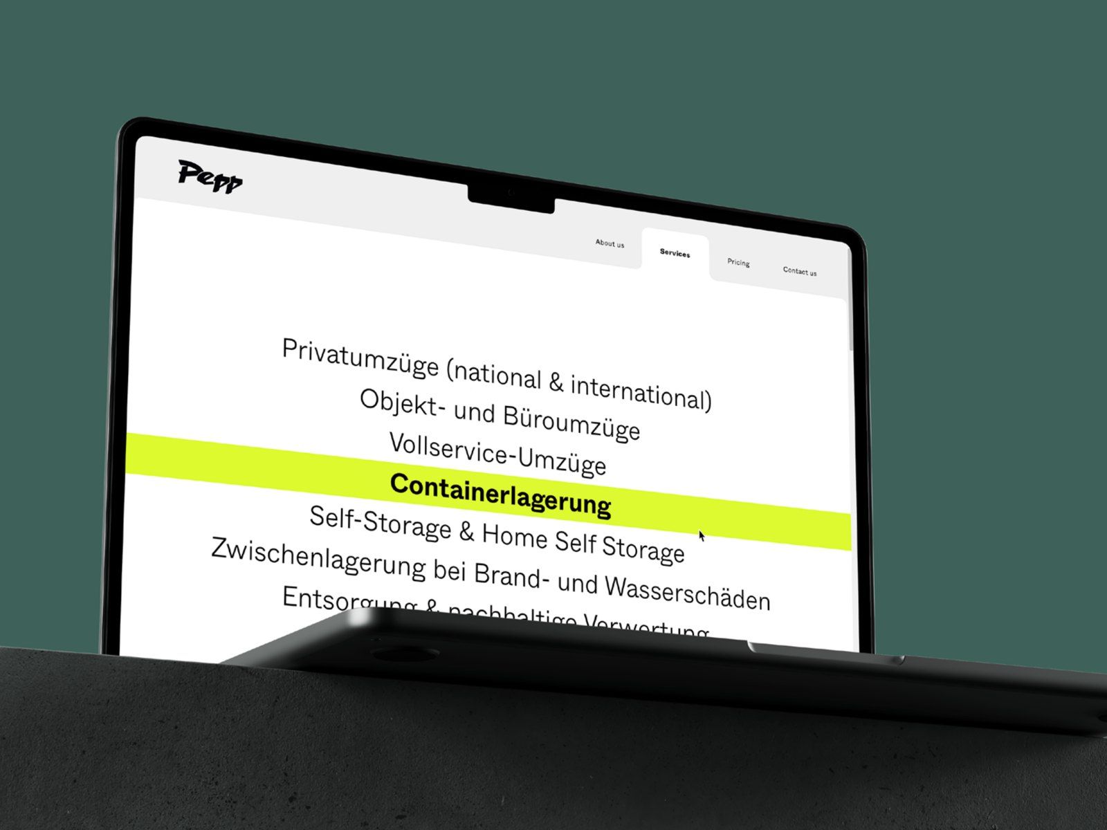
Services
Result
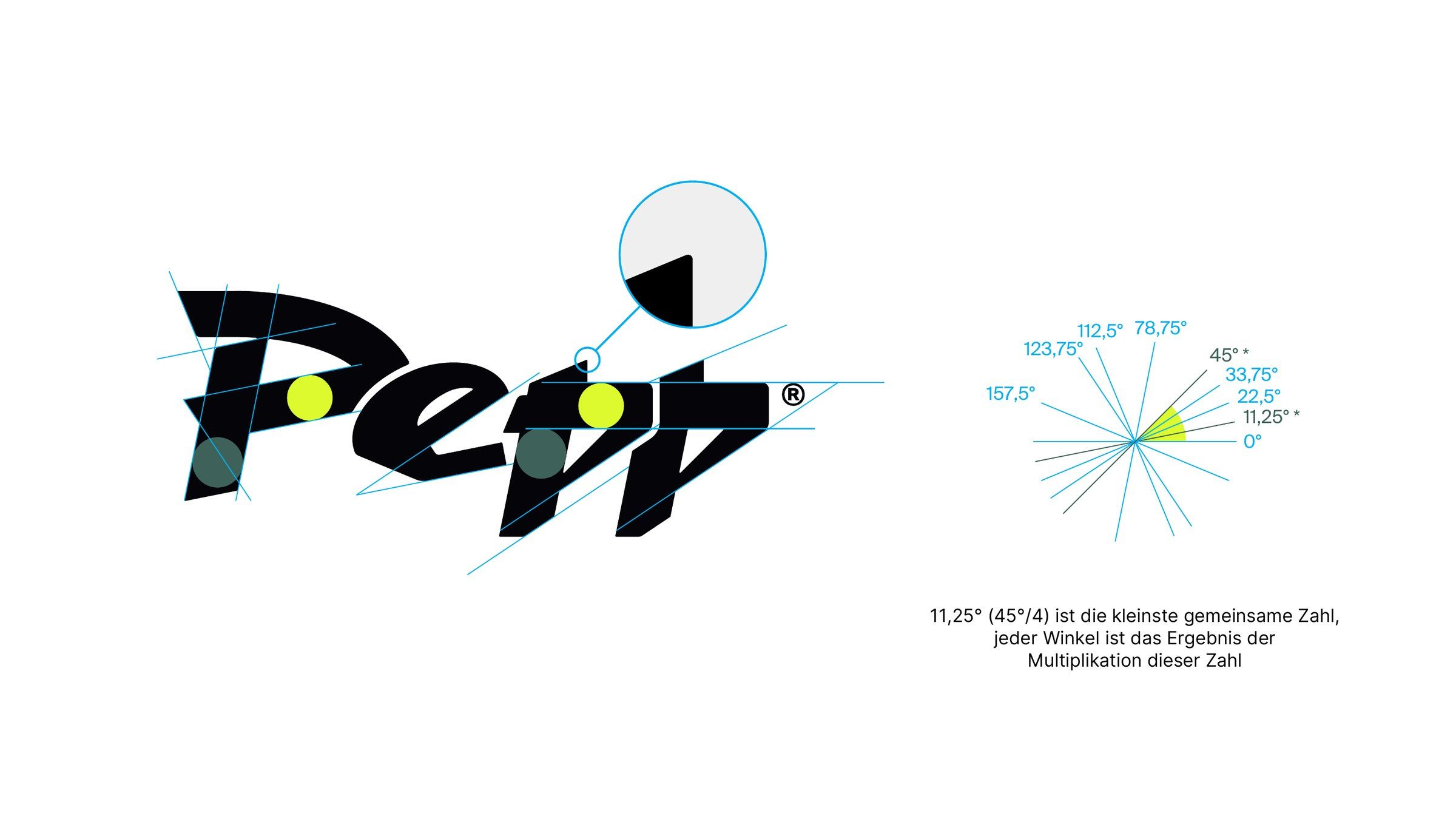
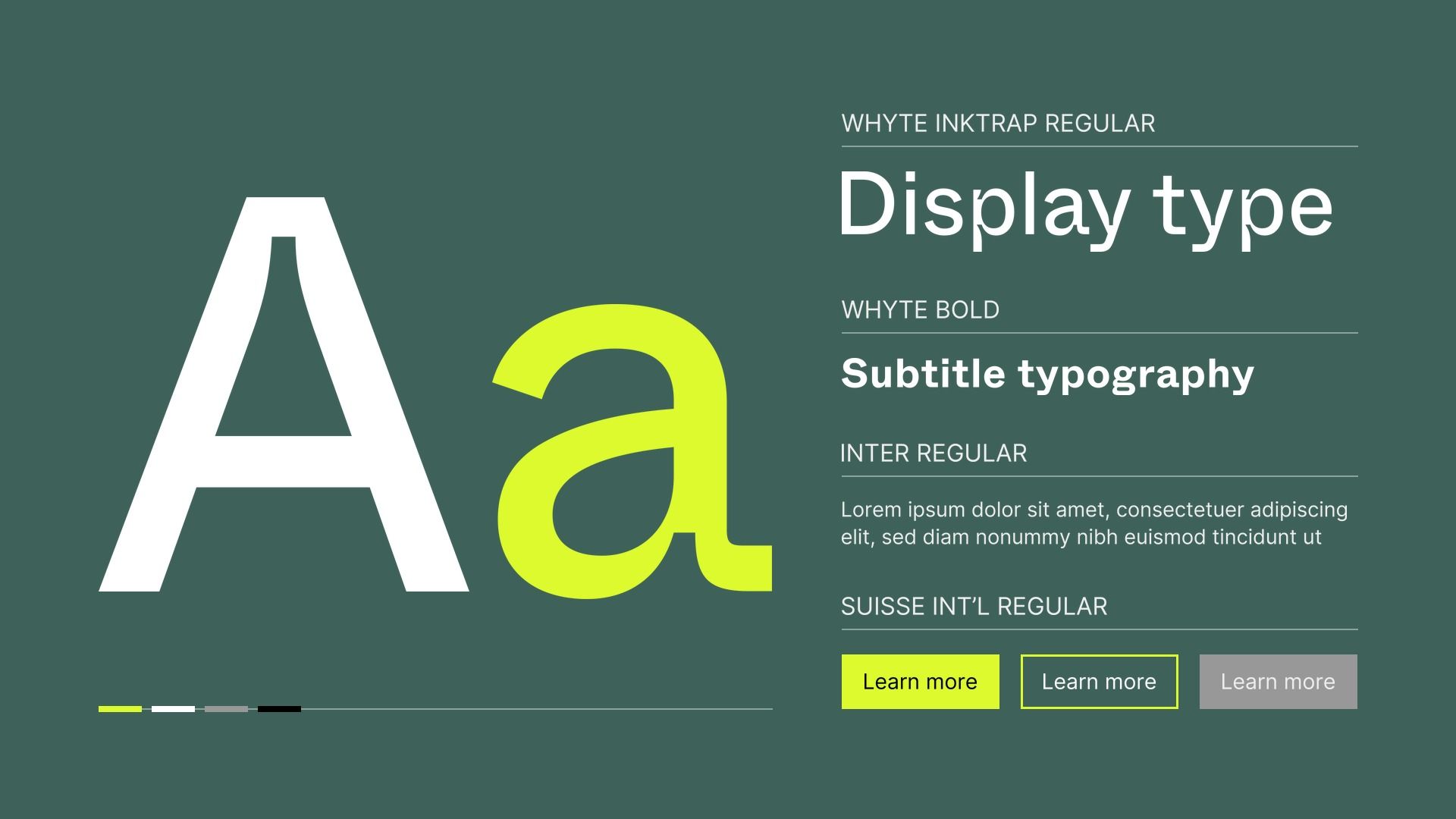
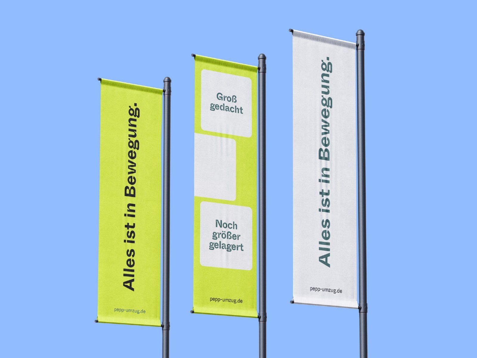
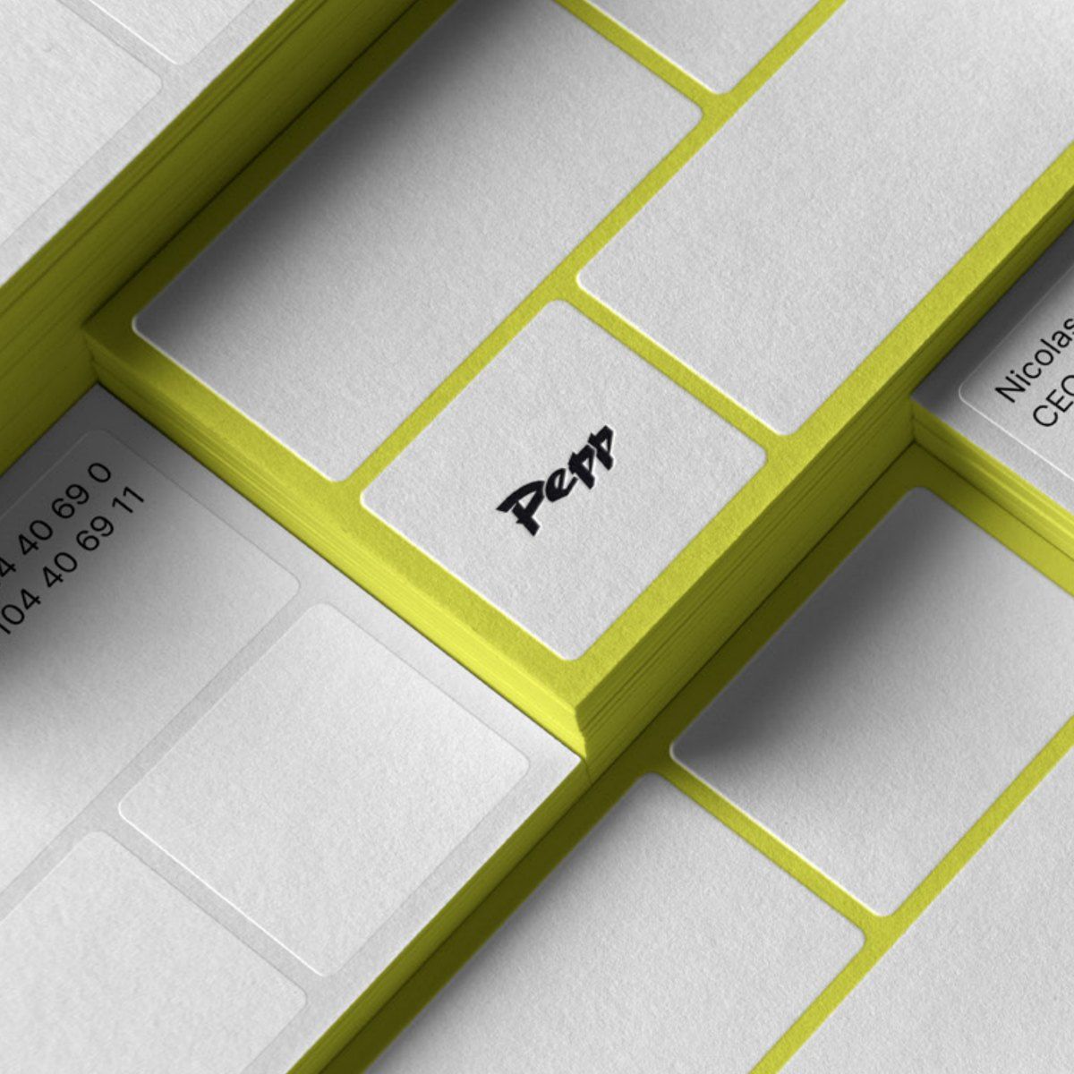
The basic shapes of the logo stayed. What is new is a grid that fixes every line: all angles are multiples of 11.25 degrees, a quarter of 45. Lime and field grey became the brand colours, with Whyte Inktrap for headlines, Inter for text and a grid of 9 × 9 modules for every printed piece.
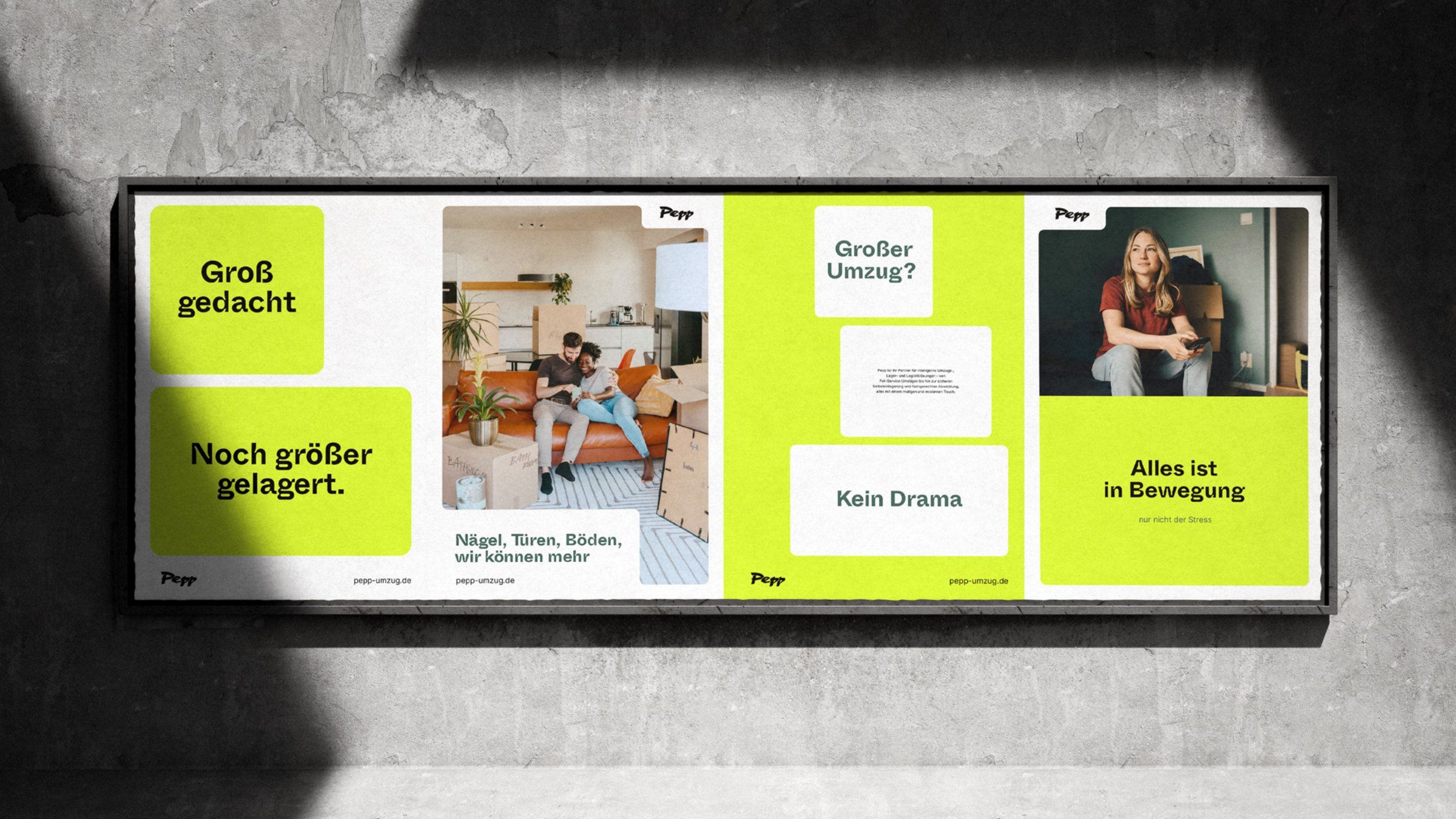
The key visuals take the weight out of moving house. One poster reads “Großer Umzug? Kein Drama” (big move, no drama), another “Groß gedacht. Noch größer gelagert.” (thinking big, storing bigger). The photos show where the move ends rather than the chaos before it: bright, tidy rooms with just enough moving boxes to suggest a fresh start.
Brand colours
- LimePANTONE 387 C#DCFA2ERGB 220 250 46
- Field greyPANTONE 5477 C#3E6259RGB 62 98 89
- Taupe greyPANTONE Cool Gray 7 C#989898RGB 152 152 152
- Anti-flash whitePANTONE Cool Gray 1 C#EFEFEFRGB 239 239 239
- White#FFFFFFRGB 255 255 255
- BlackPANTONE Black 6 C#000000RGB 0 0 0
Everything’s moving, except the stress.
Questions about this project or a new one
More than 900 projects since 2000. Room for one more.
Send us an email or give us a call. A few sentences about your plans are enough to start with.