

Recognisable everywhere
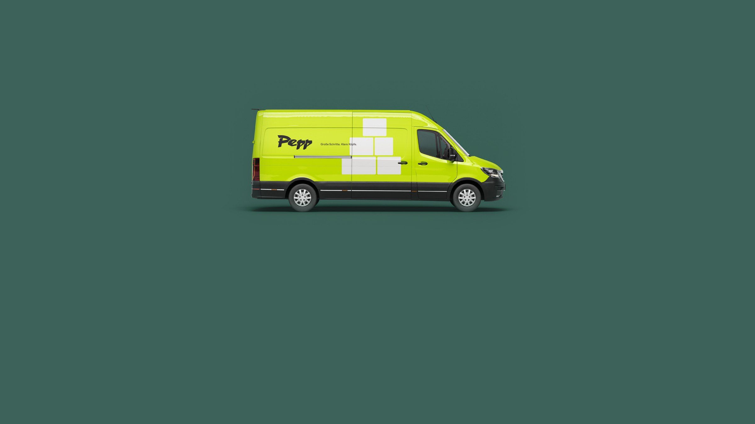
Website, proposal, trade-fair stand and job ad look like the same company, even when different teams and suppliers produce them.


An identity people recognise before they read the logo.
What it is about
Customers recognise a company by its colours, type, imagery and tone of voice, often before they read the name. We derive these elements from your positioning and test them where they have to hold up: on a phone screen, in the annual report, on the trade-fair stand and in the slide master your sales team opens every day.
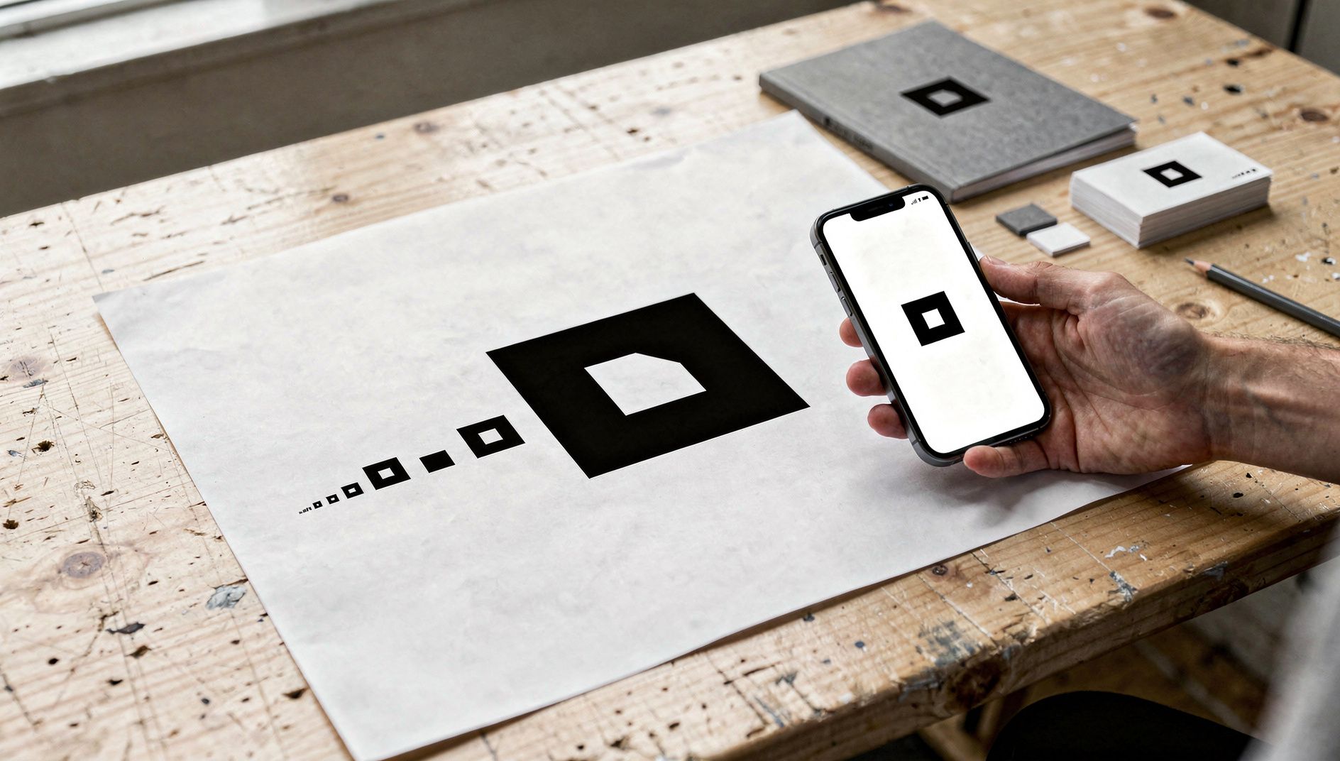
We design marks that work as a 16-pixel favicon and five metres wide on the front of a building.
A colour system with accessible contrast, and typefaces licensed for web, print and Office.
Rules for photography, illustration and layout, so that a brochure and a social post match even when different teams make them.
PowerPoint® masters, Word® templates, email signatures and social formats your team can use without design software.
A rulebook that shows what is allowed and why, available as a digital brand portal instead of a PDF if you prefer.
Website, proposal, trade-fair stand and job ad look like the same company, even when different teams and suppliers produce them.
Anyone who needs a flyer or a presentation takes the template instead of asking the marketing team.
Work